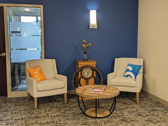
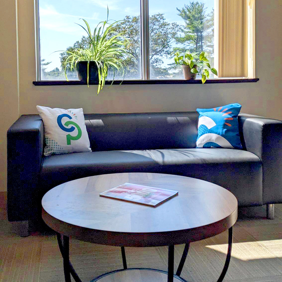
The reception seating area was designed around an antique timeclock with a circular wheel on the front. The round coffee table with black metal legs was a perfect complement to this piece.
I designed and printed custom pillow cases to add some color and bring the logo into the space in a subtle way.
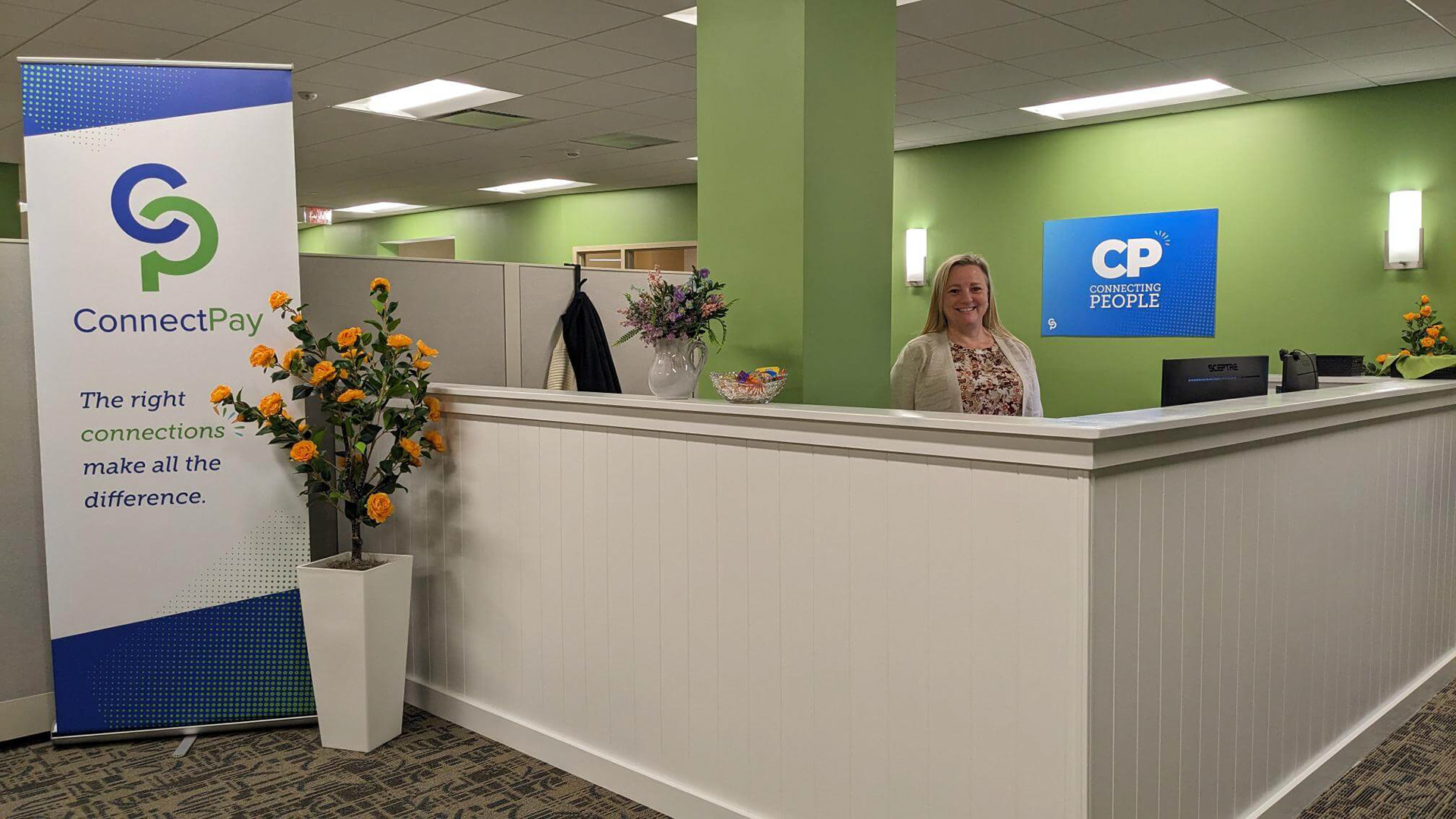
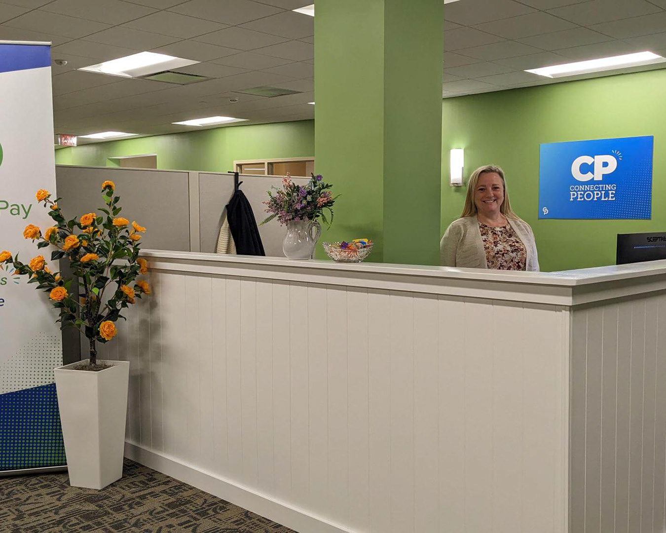
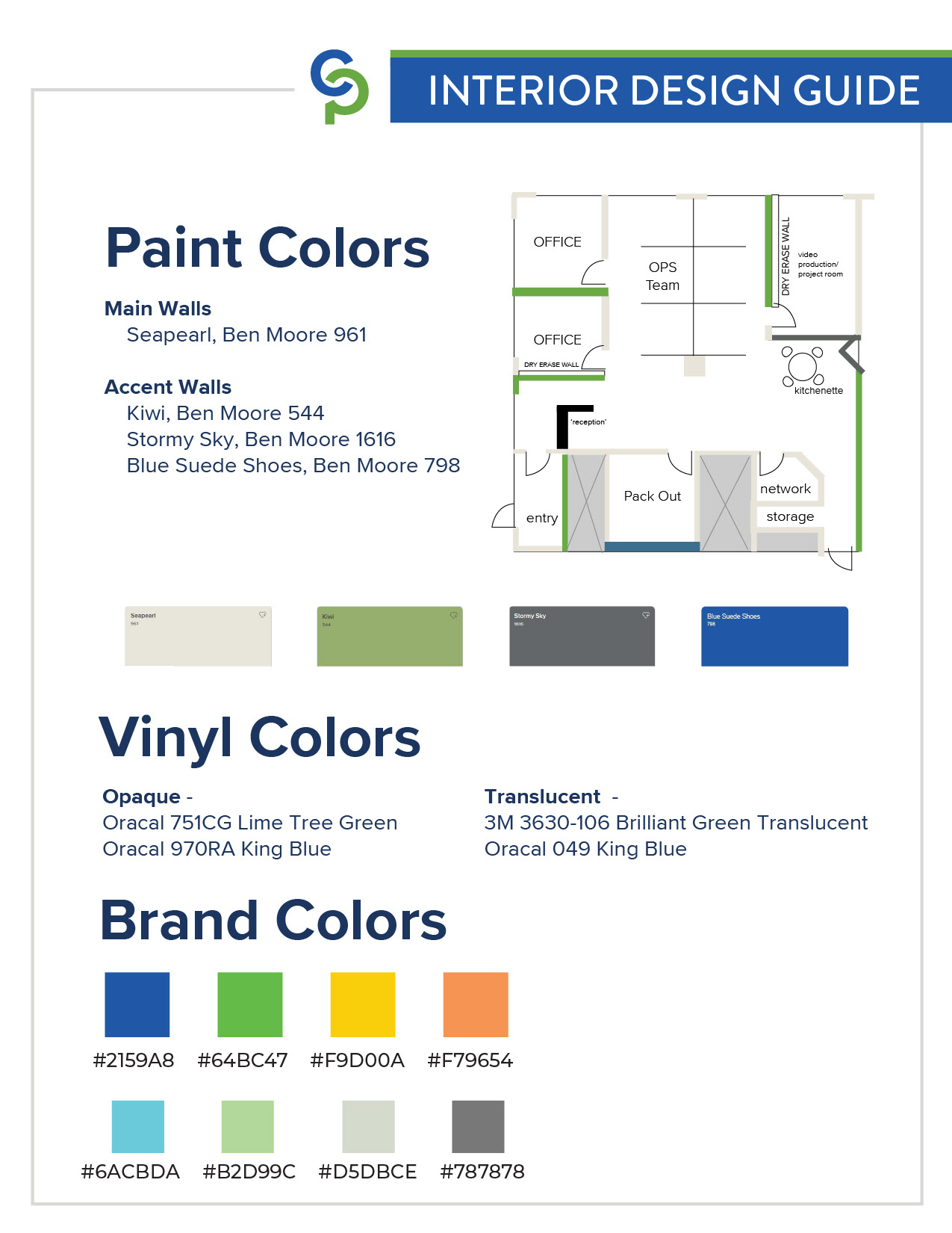
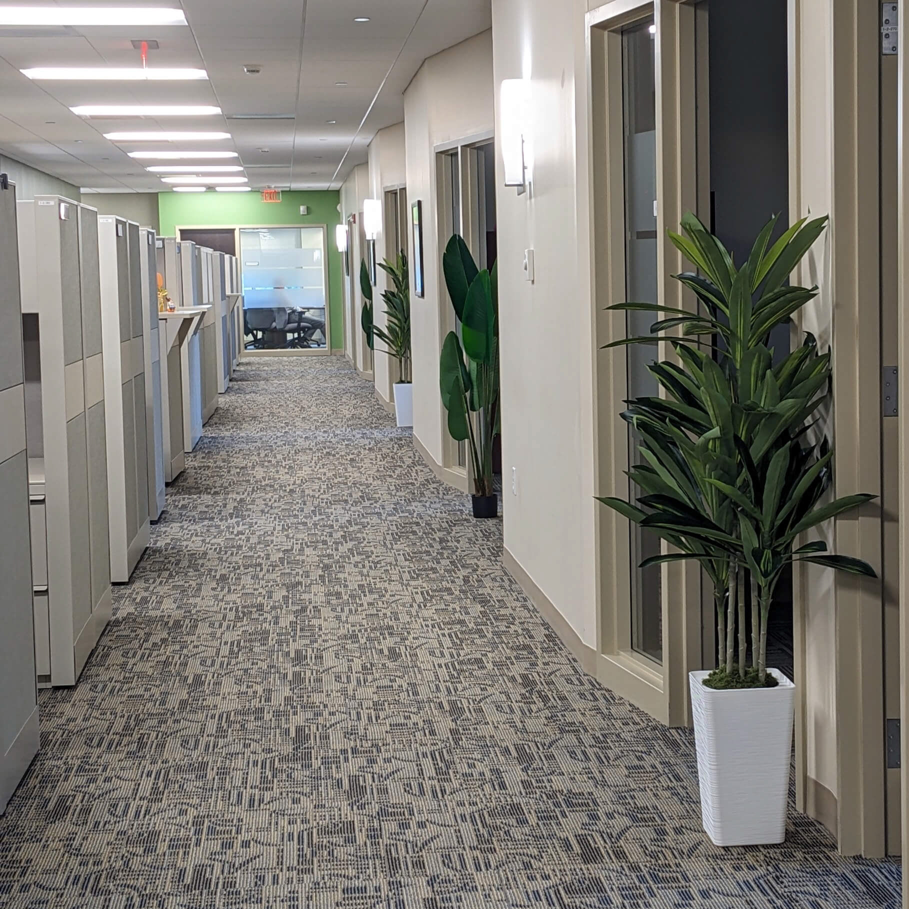
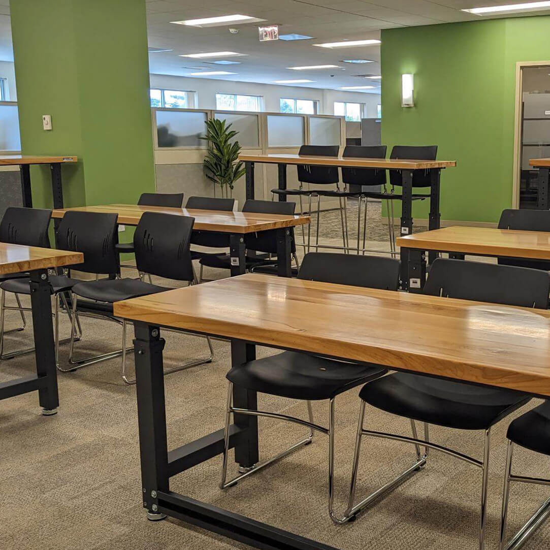
The company's signature green was painted on the main entry walls, the orange contrast color comes from the 'joy bubble' icon that represents the positive aspects of the company and is used in branding and advertising..
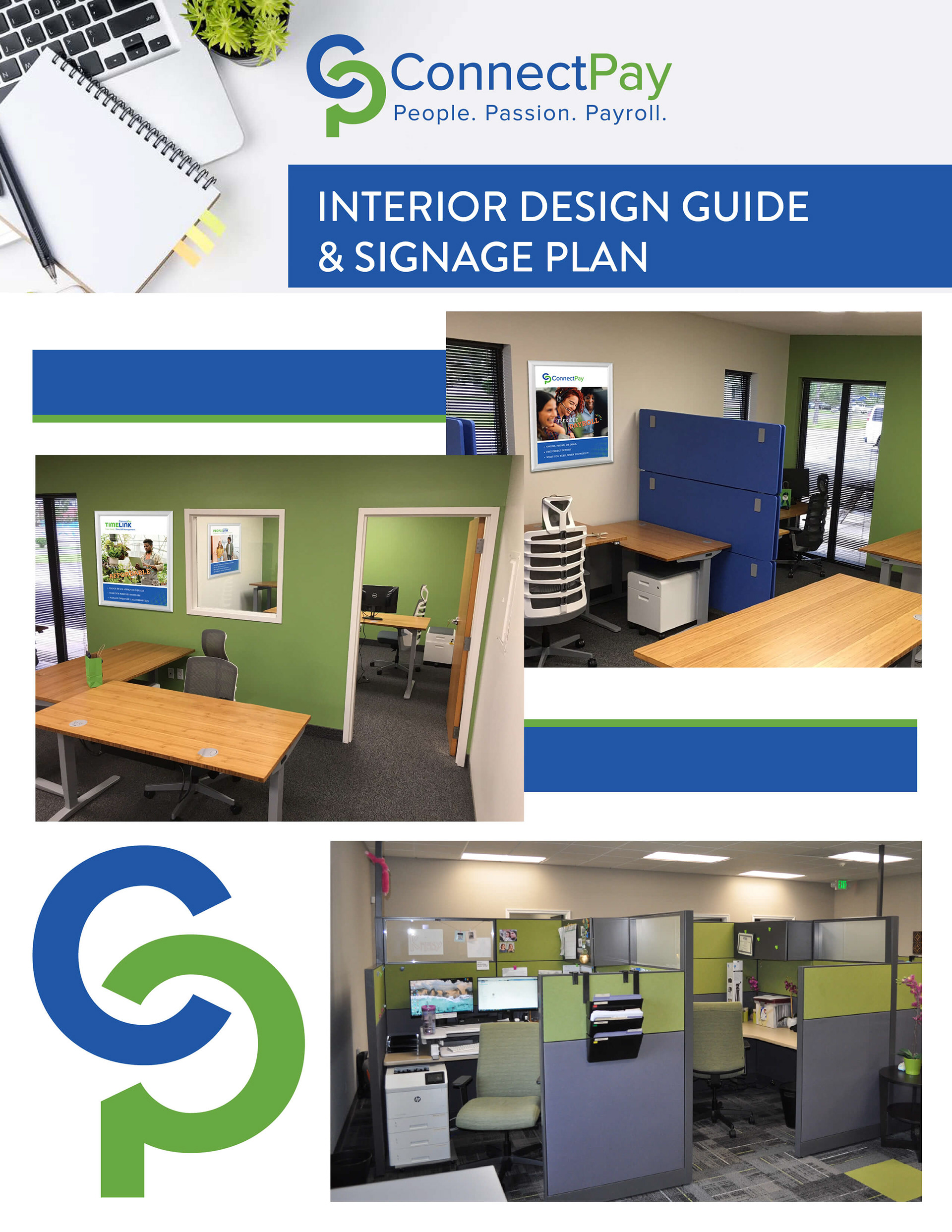
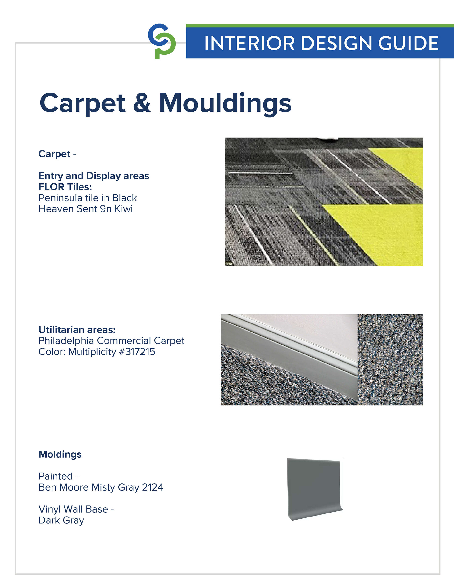
Working with the existing space in a shorter term lease, we had a limited budget for paint and fixtures. Carpet remained the same, and we focused on a few key areas to elevate and show off the brand.
the colored focal walls were selected carefully based on how people move through the space to make a maximum impact.
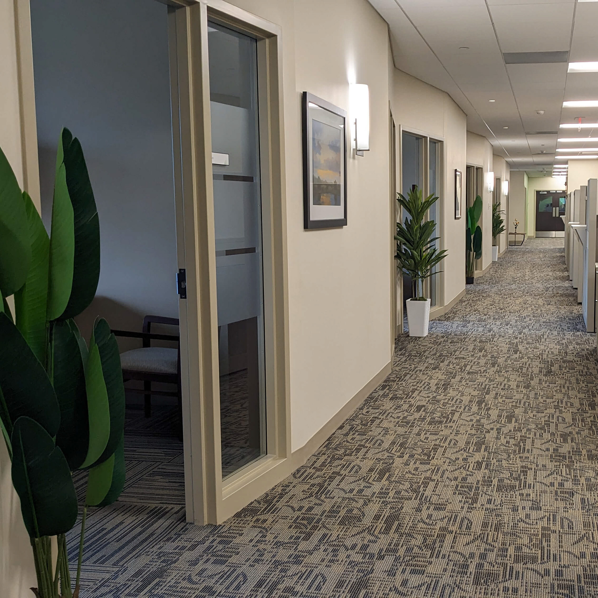
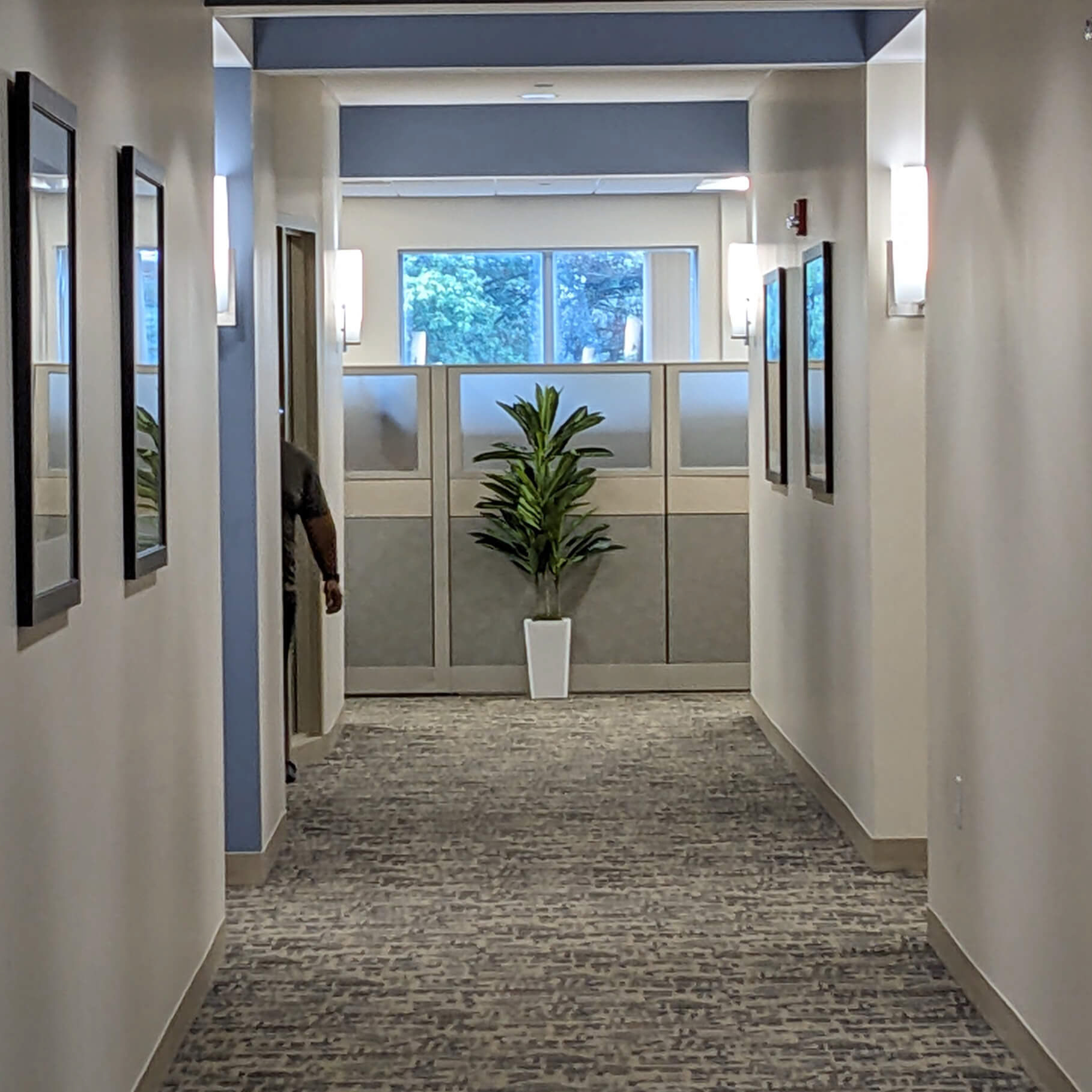
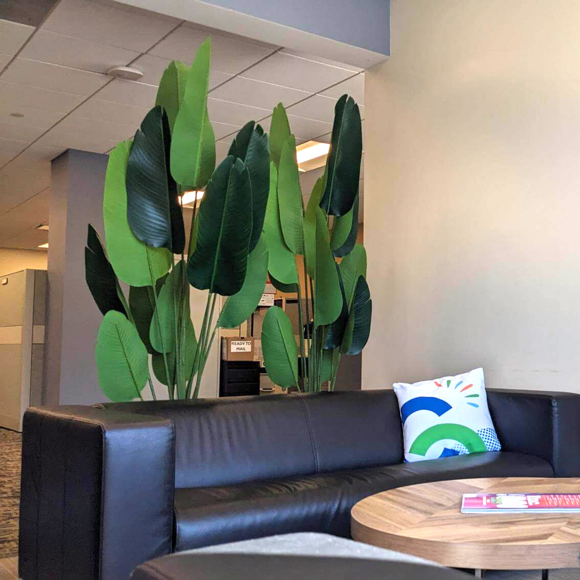
Plants were added to break up the monotony of the long hallways, add the calming affect of natural foliage, and were strategically placed to be viewed from several angles.
Due to the low natural light interior and maintenance concerns, lifelike faux plants were chosen for these areas.
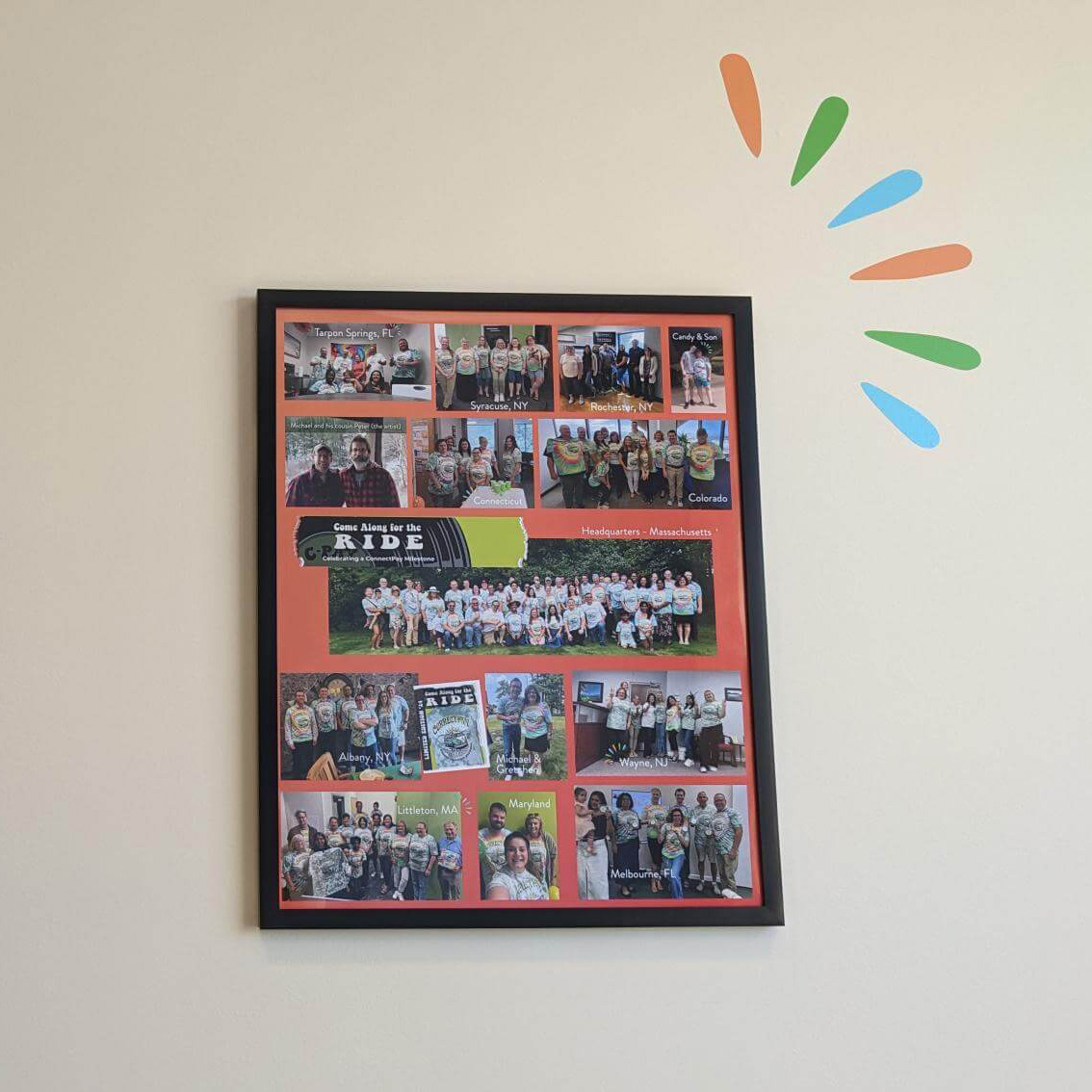
A hangout area for employees incorporates large plants as a visual barrier for privacy, and custom pillows and artwork showcasing a company-wide event.
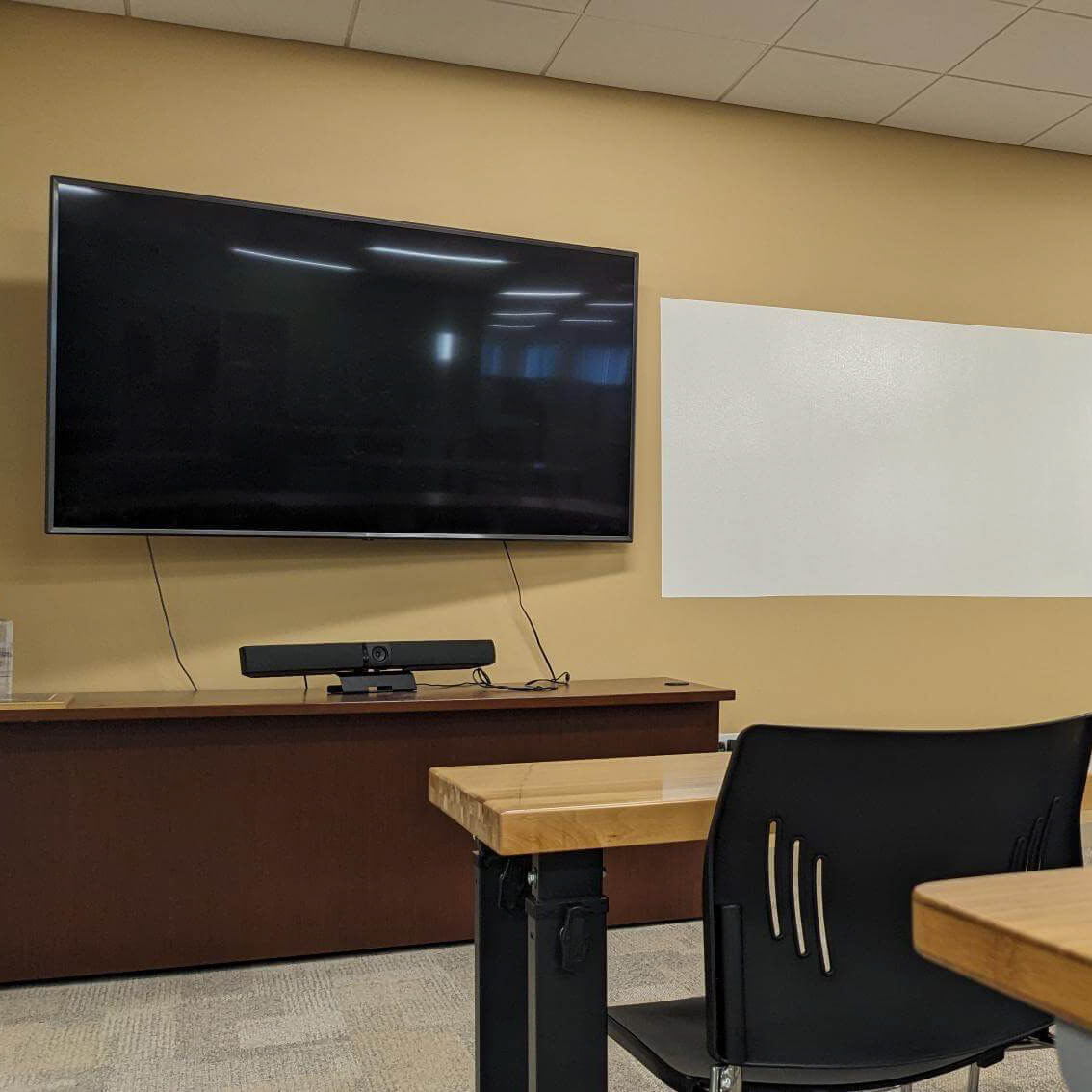
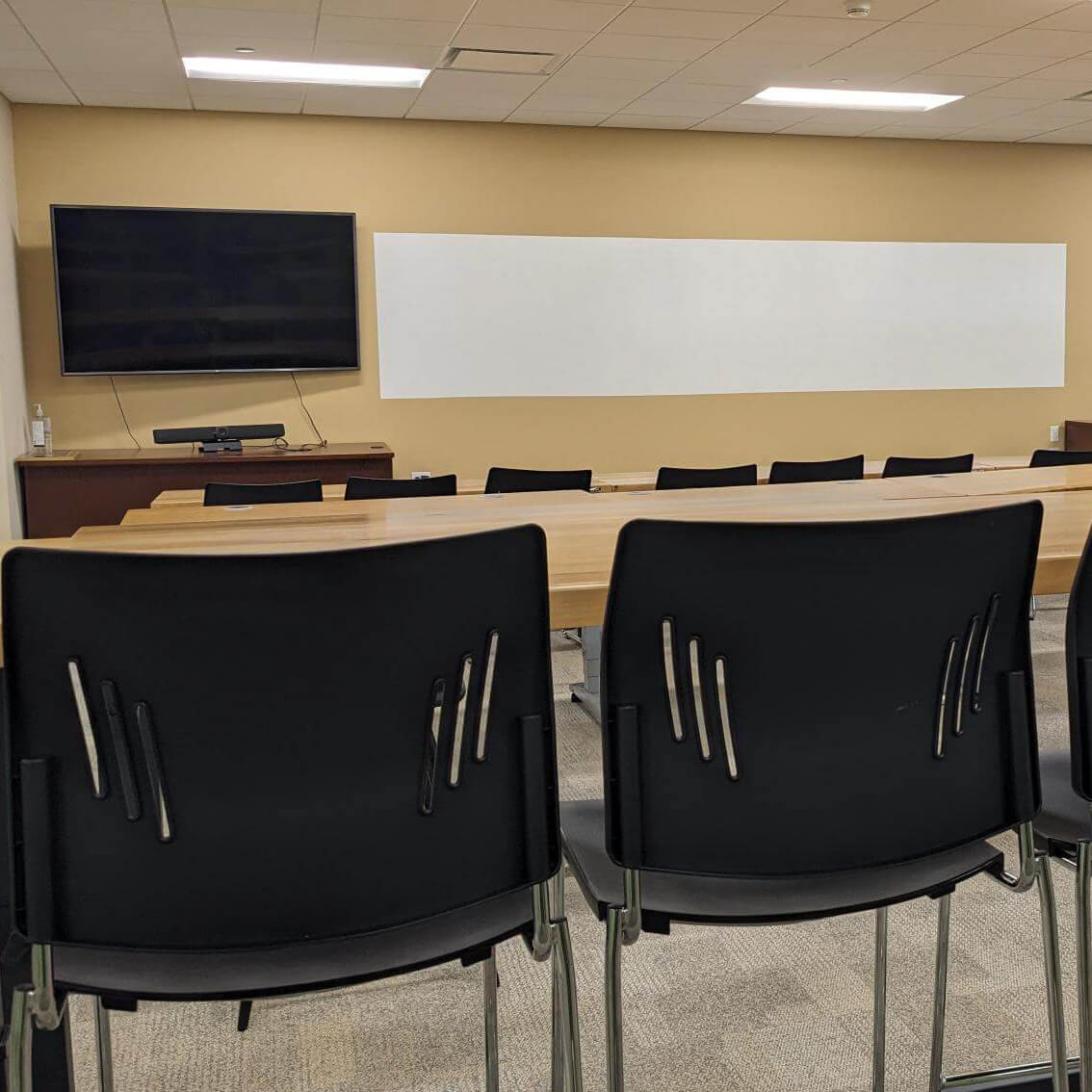
A training area was needed to host larger groups of employees returning to the office on a more regular, hybrid basis. This area is also used as a lunch area when big groups visit. High top tables at the back allow for better visibility across the room.
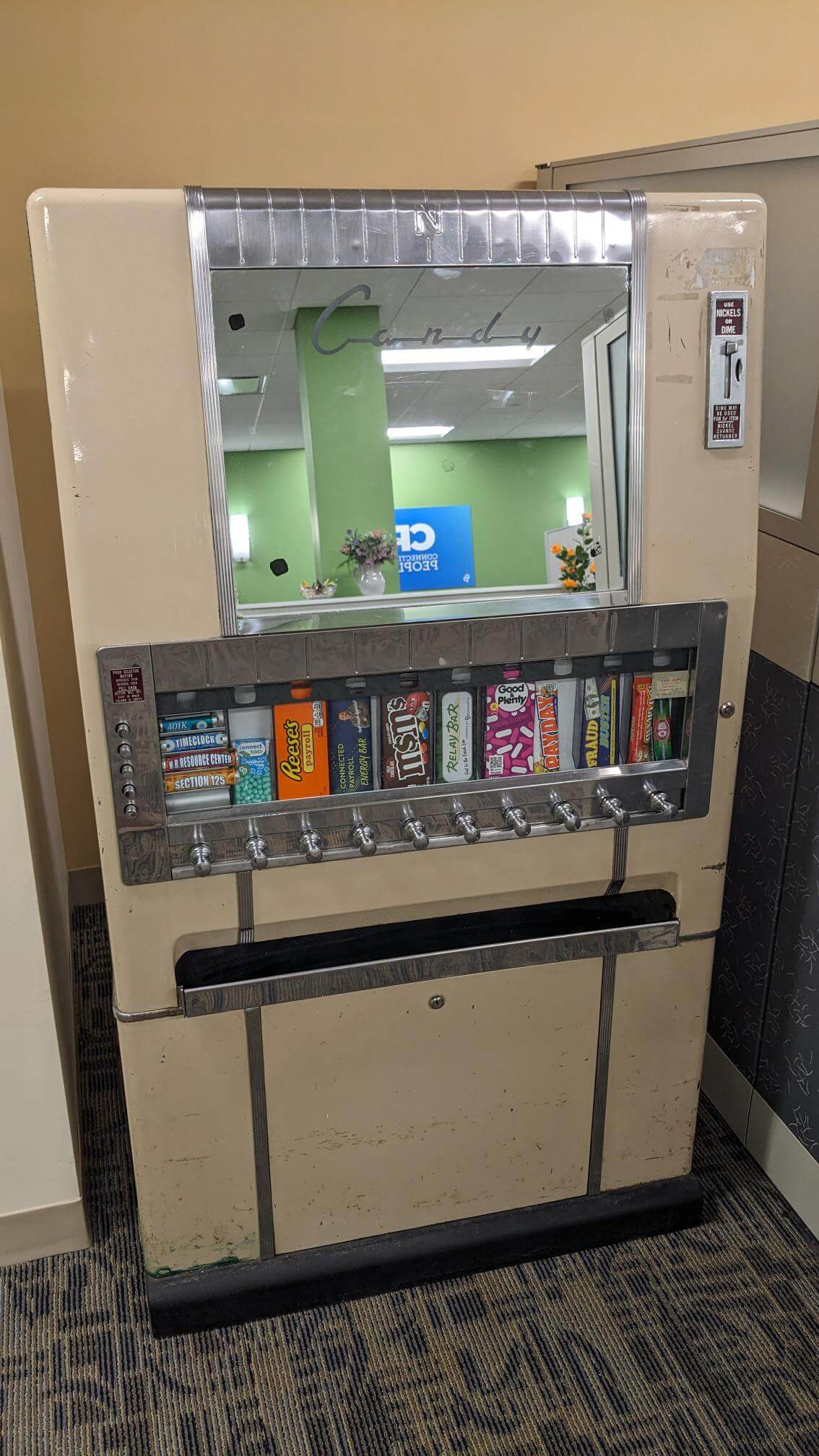
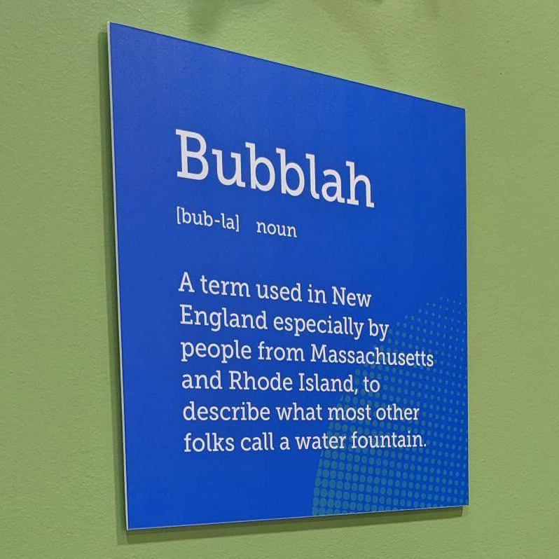
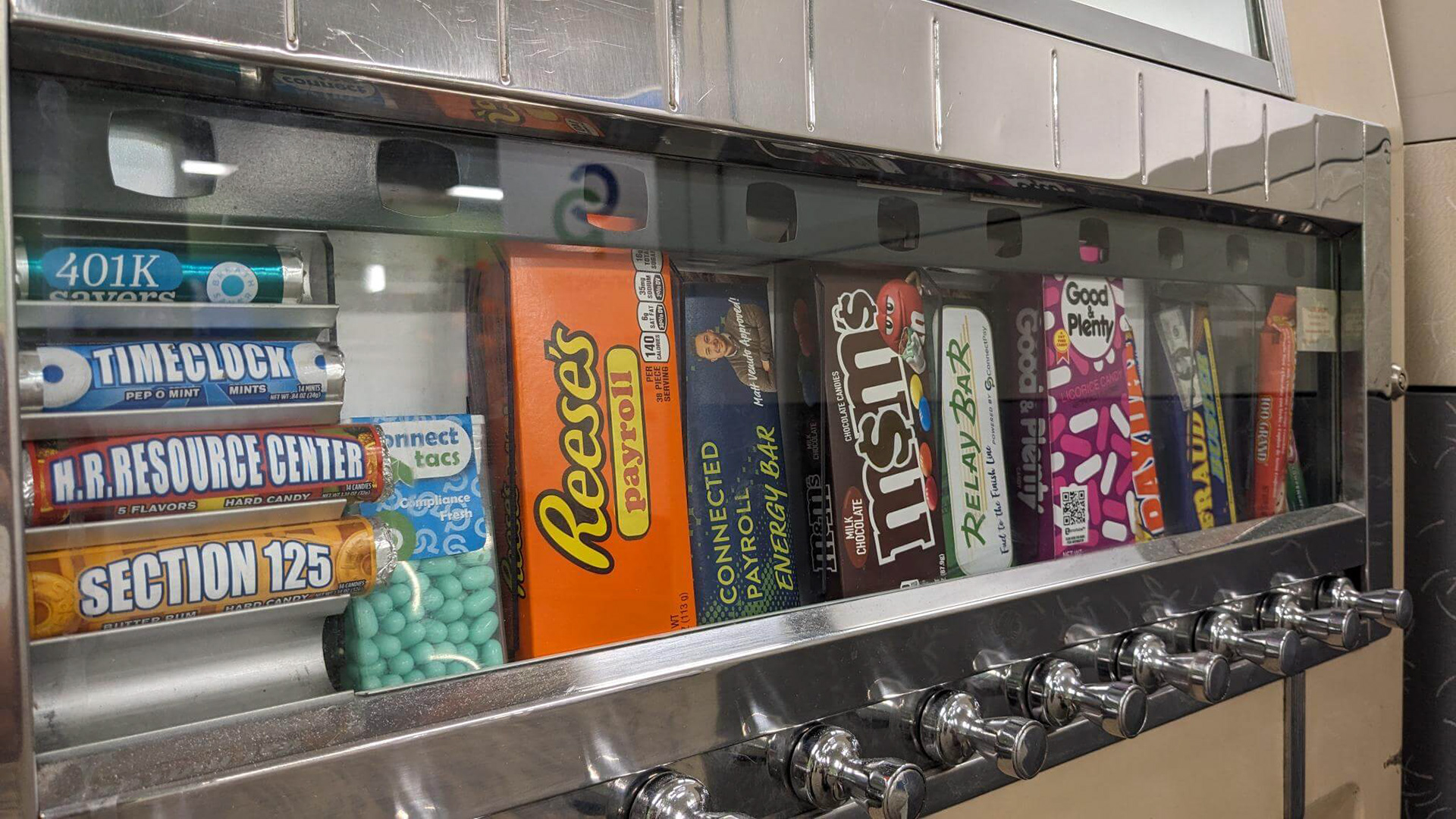
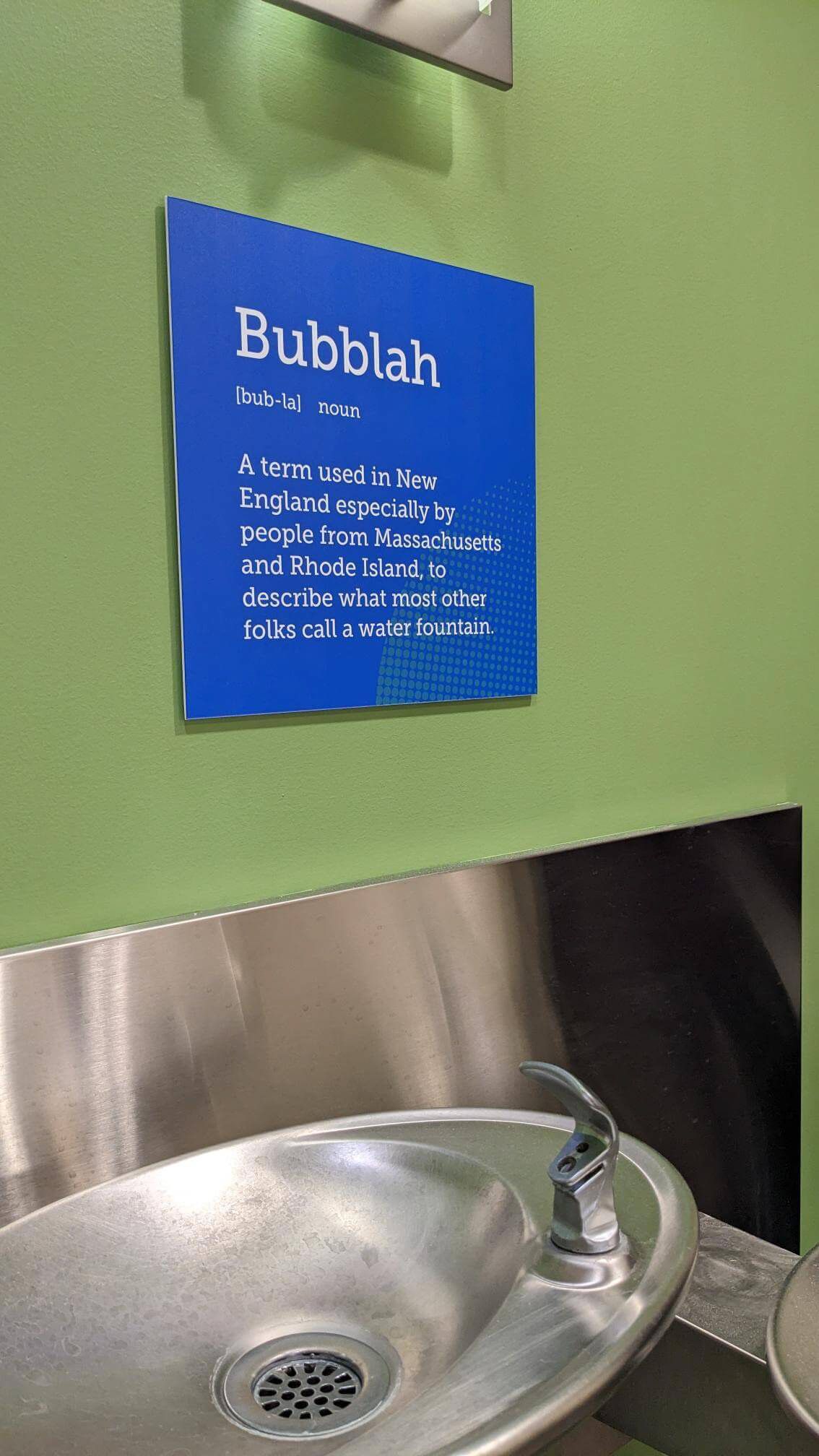
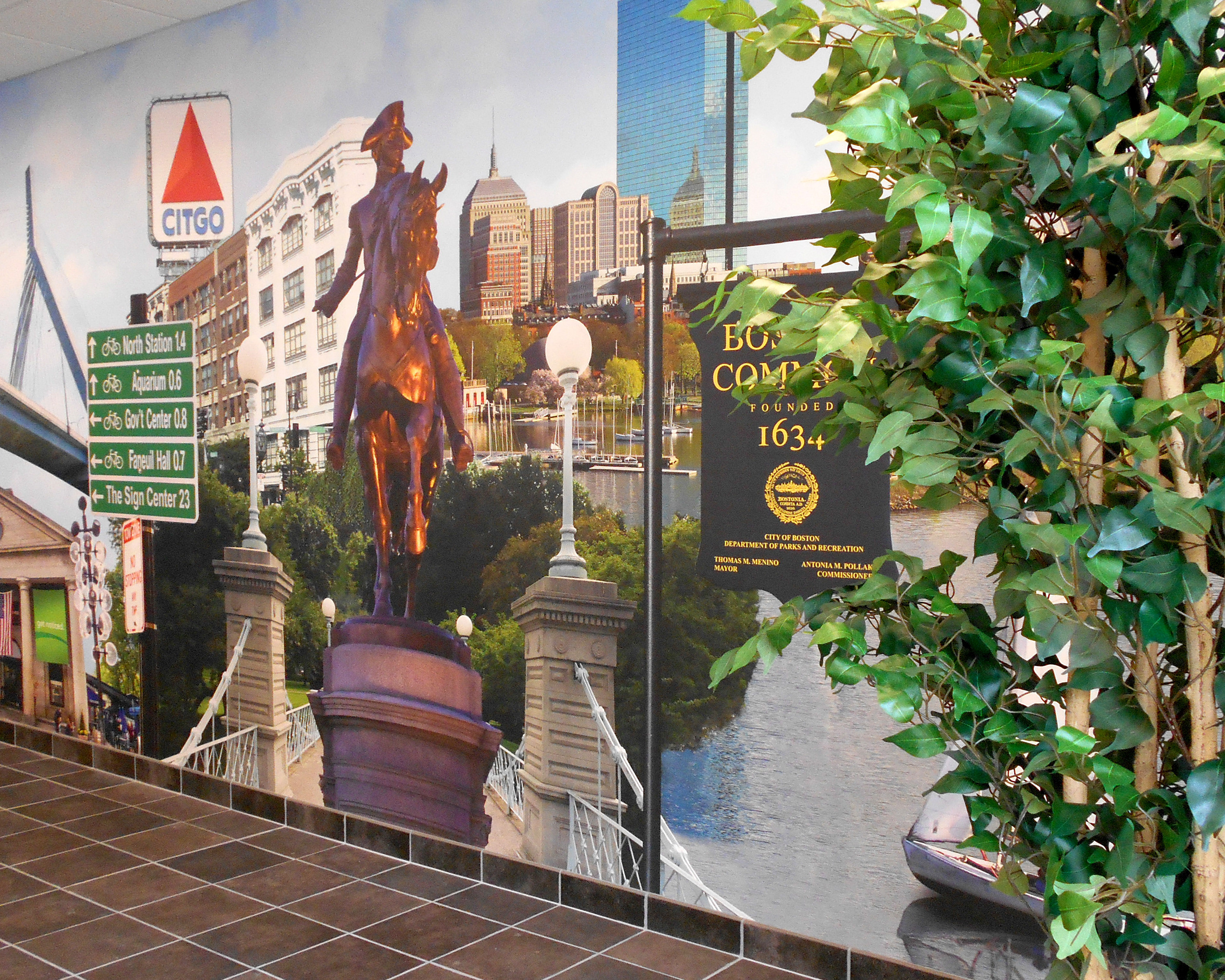
Having a little fun with the "bubbler" in our New England based headquarters. And I may have commandeered the antique candy machine - adding some 'payroll' themed candy....
Bringing some lighthearted 'easter eggs' to a space is something I love to do to surprise and delight the client!